Simple Supernatural
Client: Tosh Sturgess Ministires
Category: Book
Date: June 2010
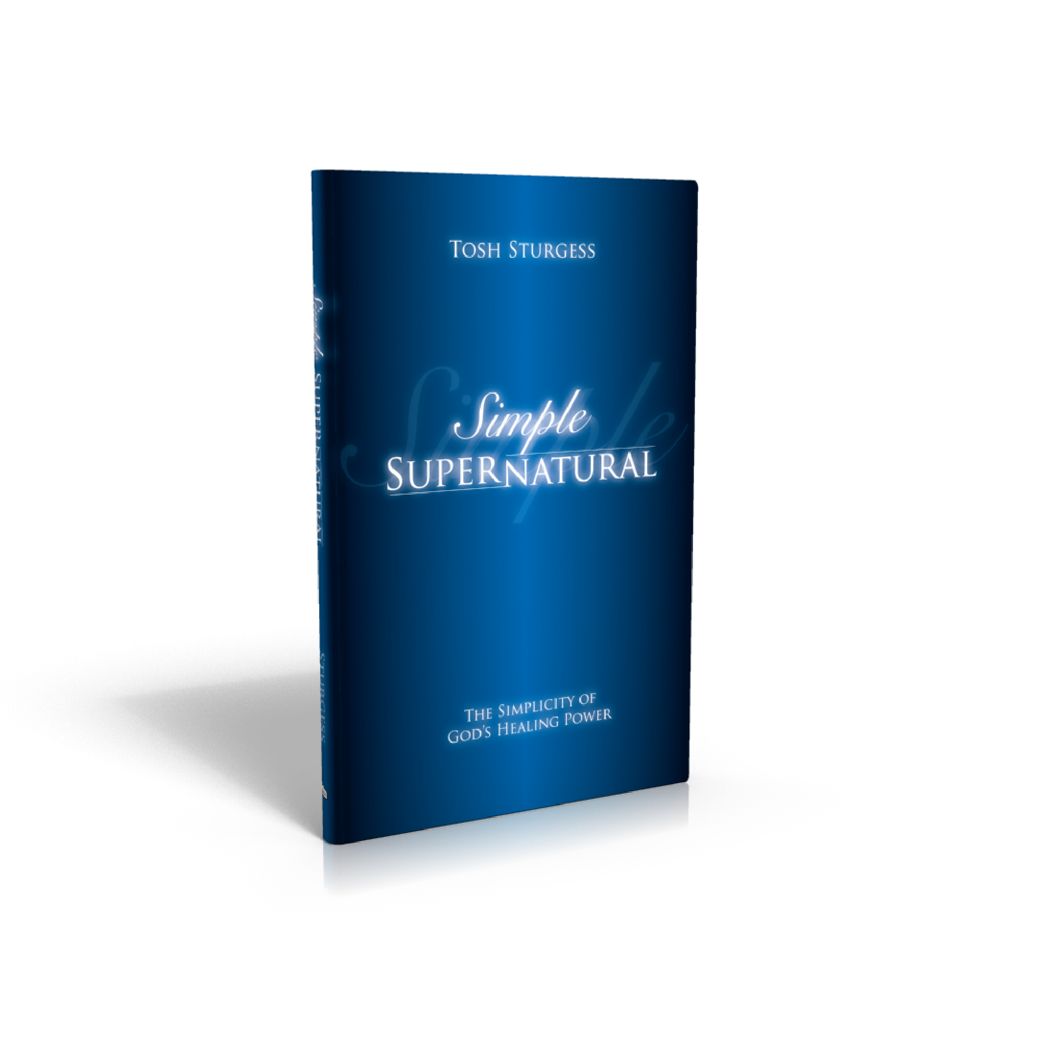
The title and premise of the book required a simple and clean, almost vacant cover. In utilizing the blue gradient from center to edge, we created an allusion to a beam of light coming through the center of the page. Simple and effective.
The lettering has a subtle graphic trope that alludes to the main theme of the book… See if you can guess what it is…
Stand alone book
Prime book in Series
Clean
Subtle Lettering
You can check out the website via the link below and also the branding job on the other products on the View Range button below.